
Cate Smith is an artist based in Edinburgh, and a beneficiary of The Royal Company of Merchants of the City of Edinburgh, Sir John Foster Fraser Fund.
She completed a BA(Hons) Painting at Edinburgh College of Art in 2013 and a MLitt Fine Art (Painting) at Glasgow School of Art in 2014 and is currently a PhD research candidate at The Glasgow School of Art, exploring translation within the expanded field of painting.
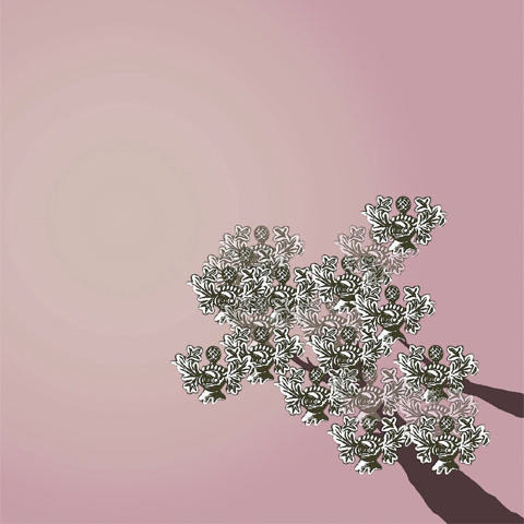
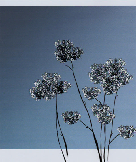
Cate volunteered to ‘give something back’ to the Royal Company of Merchants by designing a series of cards based on the Company Coat of Arms. The remit was to design cards which could be used for the Company to send for significant birthdays, for bereavements or as thank you cards; In any instance where it is felt appropriate. The Charities Committee chose two of these cards to be printed.
Cate provided us with some background into her thoughts behind her designs:
“The images and thoughts I have chosen are connected with nature. They are simple colours, of sunrises, of blue skies, of moments in nature, of time passing. The colours are also held in signs of nature, so in trees, flowers, clouds, ground, which I feel represent transience – their states are changing constantly. Grief is also a moving state, like other emotions and feelings. The MCOE Coat of Arms was deconstructed to indicate a connection between the MCOE and the viewer as we all share these experiences. So, it is all about transience, perception change and also unity and strength.
“I feel the addition of words is unnecessary, in fact they might be a distraction. In particular I feel this applies for issues such as bereavement, when the saying ‘words are not enough’ comes into consideration. Images can be representative of words—metaphors, synonyms, but they are not representative of one specific word, so they leave a space for the viewer to think about their own words, or thoughts, but more than that in stopping words they can allow space for feelings, or a connection with something you can’t quite find a word for (since it’s not provided) and this is where their strength lies. I think sometimes if you add words then you are giving people direction, particularly something they can understand or follow, but that can be limiting. Keeping the image simple, or minimal was deliberate to allow this to be a quiet, simple, contemplative and open space.”
The Company is delighted to have benefitted from our beneficiary and looks forward to being able to use these beautiful cards.